BUCK Sandbox Identity
Year: 2022-2023
Role: Creative Technologist
(Javascript, p5.js, Procedural Branding)
Full case study & credits︎︎︎
Year: 2022-2023
Role: Creative Technologist
(Javascript, p5.js, Procedural Branding)
Full case study & credits︎︎︎
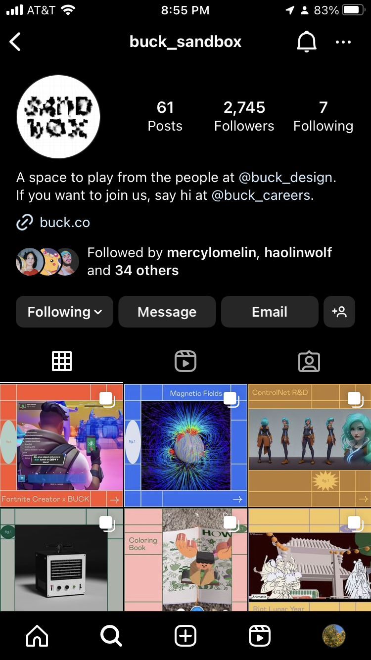
For our new R&D-focused Instagram channel, BUCK Sandbox, we needed an identity that evoked the raw, experimental spirit of the initiative.
Pushing Pixels with Code
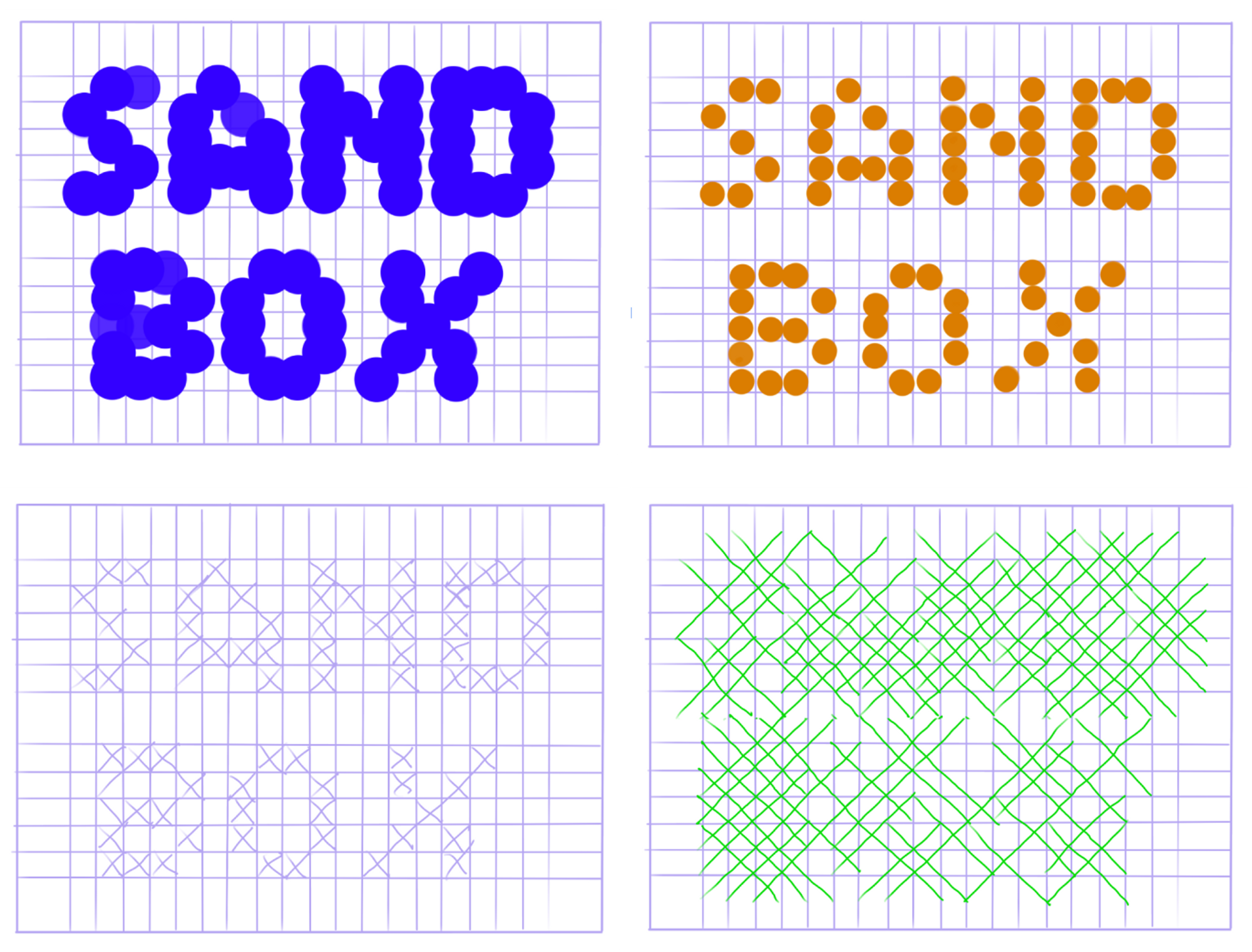
We leveraged p5.js to replace the square pixels with different sprites and create a modular grid to form the logo. We were then able to manipulate the grid with our cursor and produce a different logo just by wiggling our wrists.
But we needed to find a middle ground to ensure readability and a cohesive design.
But we needed to find a middle ground to ensure readability and a cohesive design.


Final Outcome
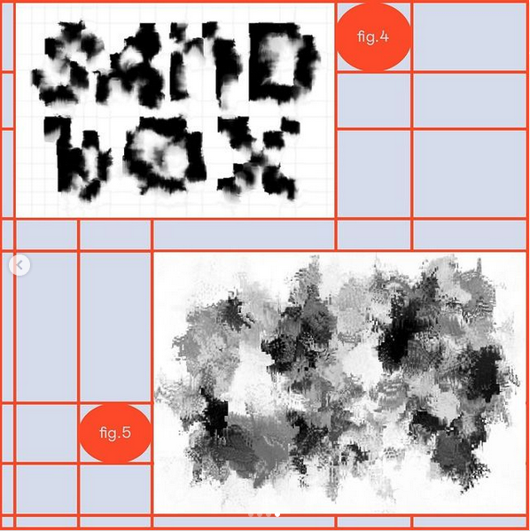
Our final logo is comprised of squares and stars that can be distorted. The latter is mapped to the current day and time to give it a life of its own, setting up a routine of identity transformation for whenever we release a Sandbox post.
As an additional interactive nugget, the CT team experimented with PoseNet to distort the logo based on the position of the user's nose. Some wacky face-dancing ensued, and the full circle of collaborative fun was complete.
As an additional interactive nugget, the CT team experimented with PoseNet to distort the logo based on the position of the user's nose. Some wacky face-dancing ensued, and the full circle of collaborative fun was complete.
One Year Anniversary Refresh
After 54 posts and one full year of this new community, we decided to revisit our identity—where a lot of the fun started—and give it a well-earned refresh. To get the ball rolling, Group Creative Director of Experience Michelle Higa Fox suggested we incorporate water as a theme, in reference to this being the Year of the Water Rabbit. Building on the foundation of our original identity, I created a glitch effect that integrated a water look to distort and wash away the logo. I matched the randomly generated color palette to the brand colors we used for the Instagram grid.